Communicating Cohesion Policy on Planet Pandemia One year on

In the article that I co-wrote with my colleague and manager Agnès Monfret, we explain how we adapted our way of communicating internally and externally when the pandemic hit our habits, our ways of working and thinking.

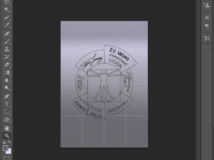
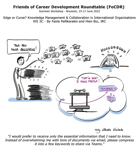
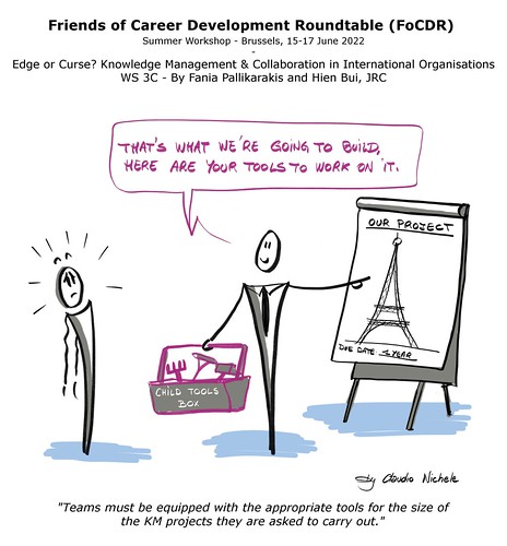
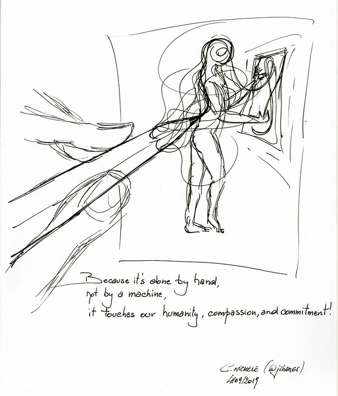
Once again, the use of handmade drawings greatly supported the messages, and brought that touch of humanity necessary in a world of communication and collaboration that has become entirely digital.

The original article was published on TerritoriALL, the EPSON magazine (page66). Thank you Agnès for this collaboration and for the work done together.

Share on:

Teleworking mindfully

Being forced to work from home due to the coronavirus pandemic brought a lot of uncertainty, fear, big changes to our lives. Teleworking mindfully makes possible to live it better! This is the main message of an online session organised by my colleagues from the EC HR department.

Their presentation is based on the work of two extremely inspiring and inspired persons: the master of mindfulness, Jon Kabat-Zinn, and Elisabeth Kübler-Ross who described five stages of grief. (it fills me with joy to see how “we” rediscover the Elisabeth’s work during this coronavirus crisis).

Teleworking mindfully, sketchnotes
Share on:

To know what you’re going to draw, you have to begin drawing

In this second post on the same topic, I will deepen my answer to the question “How to start with an empty blank page when taking live visual notes?

In my previous post “How to use space in graphic notes“, I explain what you can do to prepare yourself before an event to feel more comfortable with the practice of taking visual notes.

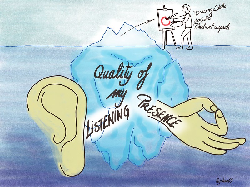
Much before the drawing skills, the logistic, and before any other practical aspect, what will really influence the outcome of your work is the quality of your presence and the quality of your listening.

Presence and listening

Quality of your presence

You really need to be fully present when taking live visual notes at an event. Firstly, this means that you have to be connected as much as possible with all of “you”, with who and with what you are. Simplifying it a little bit, you need to access both sides of your brain and let them work together. Or – I prefer to say it like that – let the two sides of your brain “make love” in you. You need also to be connected with the surrounding world. This last point seems obvious but if your focus is on the choice of the marker’s color or on your space consumption on the paper sheet….you risk to not being connected with what is happening around you, and with what is said.

What is said? What is really said and what do I hear?

Quality of your listening

Like with traditional text notes, how you listen and to what you listen will bring you to very different results. Except that with visuals, the difference will be felt even more than with just text.

I recommend the following material from experts to know more about “Listening”:

4 Levels of Scribing

http://www.coachwiththegreenhat.com/listening-is-good-for-you-four-steps-to-mastering-active-listening/

A better presence and a better listening

The quality of both your presence and your listening will greatly influence your ability to take visual notes and, finally, your outcomes. Therefore it is worth to prepare yourself a minimum before you start. Some minutes before you jump on your markers, take the time to do some exercises of meditation, or mindfulness, or yoga, or relaxation. Whatever can help you is welcome. And if nothing comes to you, just try to close your eyes, breathe slowly and deeply, and have at least 10 of these breaths.

Last but not least…

The more you will practice, the better!

My last recommendation is to start to practice as soon as possible, then to practice and to practice again.

I would like to conclude with two quotes. First is this Pablo Picasso’s answer to the question whether ideas come to him “by chance or by design”:

“I don’t have a clue. Ideas are simply starting points. I can rarely set them down as they come to my mind. As soon as I start to work, others well up in my pen. To know what you’re going to draw, you have to begin drawing… When I find myself facing a blank page, that’s always going through my head. What I capture in spite of myself interests me more than my own ideas.”

Then – to keep you from believing that the Picasso’s reference implies that we treat art here – this Mike Rohde‘s quote applicable to all visual notes in general:

“Sketchnotes are about capturing and sharing ideas, not art. Even bad drawings can convey good ideas.”


Related post: “How to use space in graphic notes


Share on:

How to use space in graphic notes

Sketchnotes How to organise space in graphic notes
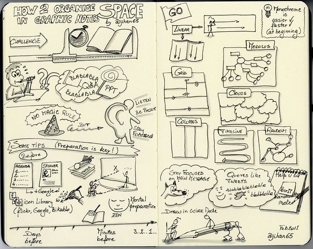
There are no magical rules to succeed! Only practice will help you to capture the essence of a speech, a presentation, a training, in… a short amount of time and space!

The practice consists in listen for key ideas, then recognize verbal cues that best identify these ideas and quickly replicate them through drawings and visual elements.

Preparation is key! What can you do in advance?

  • Get as much information as possible on…
    • the agenda: timing, talk points, breaks, etc, everything is precious
    • the speaker(s): background, photo, speaking style and pace
  • Prepare a library of possible icons and visuals on the subject by drawing them on a piece of paper from internet or Bikablo books
  • Prepare your sketchnotes:
    • Title, date, place, name of the speaker, twitter account/website, etc
    • You can sketch the speaker from a photo, the location (Paris, Bxl, NY), etc
    • Any footer with your signature?
    • If you are sure, you can already draw lines with a pencil to divide the available space in sections

Before the start

  • Choose a strategic place:
    • To have a clear view [then not the back of the room, nor the first row]
    • Comfortable enough to have your bloc-note and pens handy
  • Like an athlete before a competition, put yourself in the right mental condition:
    • Connect with yourself, with all your means, with your imagination and your fantasy
    • Don’t be afraid, your role is not produce a full transcript [minutes takers are there for that, or not, not you]
    • You can miss elements, don’t worry, your intuition will support you
    • Breathe calmly and relax you
  • Divide your paper in sections corresponding to the schedule but be VERY CAREFUL with that:
    • Speakers are unpredictable:
    • It’s better to capture what they really say, instead of anticipating what they had planned to say
    • Don’t numbered in advance their points, they can skip a point to stay in time or they can forgot to mention it
  • Remember that no law requires that your work is to be confined in one single page

Let’s go

  • Depending on your skills/mood of the day, you can prefer to work in monochrome or using more colours (a maximum of 4 colours is recommended by Brandy Agerbeck). You can also postpone full colourisation for after the event and use my guide How to colour your drawings in 10 steps
  • Depending on your preparation or intuition, you can opt for one of these models:
    • Linear which is the most common, easiest, more secure. It can spread on several pages with a typical start from the top-left corner, then continue to the bottom or to the right
    • Modulus like mind-map or web. Typical start from the center, use of lines to connect containers, any kind of lines and containers
    • Grid like in comics
    • Clouds
    • Columns
    • Timeline
    • Random
      Sketchnotes How to organise space in graphic notes
  • Stay focused on the main message and try to discard details that don’t reinforce it
  •  Forget to capture everything, that’s not the goal. What matters are your takeaways about what you considered important
  • Note great quotes like tweets, represent them visually
  • Draw simple objects in wire mode, especially people, you can come back on them later
  • Use a pencil to write keywords on which you can come back later
  • Use post-its (I use plenty of post-its)

Beforehand practice

  •  Search on sites like RSA, TED.com, Coursera for a short but inspiring speech and sketch it
    • Do it alone, or better… with others in order to compare, explain, confront your ideas [community of practice principles]
  • Build your own visual library by drawing in a sketchbook your icons to represent real objects like cup, pencil, doors, etc, and more abstract concepts like collaboration, idea, planning, etc.

Related post: To know what you’re going to draw, you have to begin drawing
In this second post, I expand my answer by talking about the importance of presence and listening.


Share on:

How to colour your drawings in 10 steps

I published this article on Evernote in 2015 to answer questions from non-expert colleagues who were asking me how to simply colour a drawing on a computer. Since they regularly ask for it, I decided to import the article here on my blog.

I will explain a very simple and quick method. It is simple but complete. The starting point is (can be) a piece of paper with the drawing. Ideally, the drawing is not already coloured and the lines are in black ink on a white background for a strong contrast. If not… it’s still possible but you will spend more energy.

The method uses Adobe Photoshop CS6 but all steps are applicable to older/latest versions of Photoshop and on GIMP too. If the method does not use any advanced functionality, I assume, however, that you have a basic knowledge of Adobe Photoshop, or equivalent, to feel comfortable in the tool. Note that in the text below “Adobe Photoshop” is shortened in PS.

Last but not least, you can work with your mouse, then you need a good mouse and a good dose of patience, but the ideal is to work with a tablet and a stylus (Wacom for example).

Step 1: Digitalise your drawing

You can use either a scanner or a camera to convert your hand-made drawing to a digital file. A scanner is the best solution for sketches on a paper which size fits with the scanner (common sizes are A4 to A3). You have companies that offer the scan of very large supports but this service has a price. Otherwise, using a camera is always a good alternative for all kind of sizes.

  • When using a scanner, check these settings:
    • Resolution set at 300 dpi minimum, ideally 600 dpi
    • Always use the Color mode, even with B/W drawings
  • When using a camera, whatever the device or model, ensure:
    • A uniform and constant lighting on the whole drawing surface to reduce shadow areas to the minimum. Indirect lighting is the best. Never use the flash!
    • Your camera lens and your drawing are on parallel planes to reduce distortion to the minimum.
    • Use a tripod or keep your hands steady to avoid motion and blur.
  • Camera or smartphone?
    • Cameras (DSLRs or Compact System cameras) still offer a better resolution and sharpness due to their larger sensors – a 50mm lens gives the least distortion -, and they are still superior in low or difficult lighting.
    • Lighting is very important when using a smartphone.
    • For both: take a bunch of shots with different setups and select the best result.
    • There are plenty of good, and free, scanner apps for smartphones. Just google ‘best free photo scanner app’ to choose one.

Step 2: Import and prepare

I would never say it enough: Always work on a copy of your original file!

  • PS Menu > File > Open : select your file (a copy or your original!) on your computer and open it
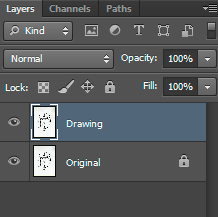
    • Display the “Layers” window: PS Menu > Window > Layers (F7)
    • Your drawing is in the unique visible layer called “Background”
  • Double-click the “Background” layer to unlock it
  • Rename the layer into “Original”
  • Duplicate the layer and Rename the duplicated layer in “Drawing”
  • Hidden and Lock “Original” layer. We will work on “Drawing” layer
Step 3: Adjust: Rotate / Cut

  • If your image is not oriented correctly : PS Menu > Image > Image rotation
  • Often with a photo, you have first to change the perspective of the drawing to a rectangle: PS Menu > Edit > Transform > Distort or Perspective
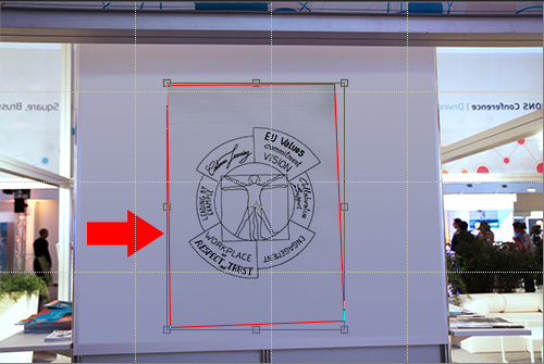
  • Then discard from the image what is not relevant around the drawing:
    • PS Select tool > select the zone of the image that you want to keep. You can always adjust your previous selection: Menu > Select > Transform selection
    • PS Menu > Image > Crop

Step 4: Adjust the white balance

As in our example, the white balance is never correct from photos (remember the importance of lighting in step 1?). Depending on the quality of the photo, you can try one of these techniques, or combine them. Play with them to discover which one works best for you:

  • PS Menu > Image > Auto-contrast
  • PS Menu > Image >Adjustments > Brightness/Contrast
  • PS Menu > Image >Adjustments > Levels
  • PS Menu > Image >Adjustments > Curves
    This last technique is my favorite because it allows you to define your white, gray and black points with samples in the image:
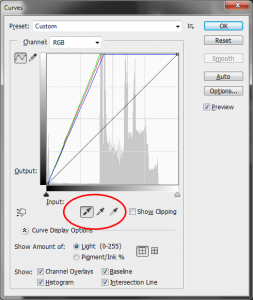
    Look at the result with Curves:
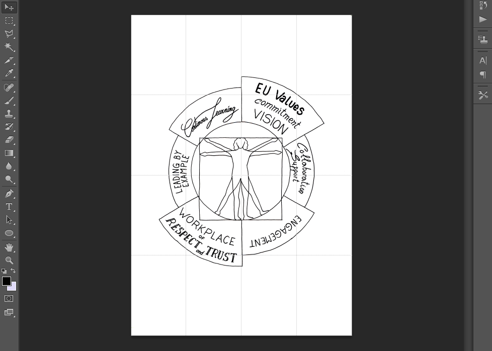
  • For photos of landscapes of several meters (common in graphic recording), you should envisage to divide the image into several areas, apply the “Curves” tool on them and mix appropriately them. Read this article in French by @_Fanny_ThomasComment retoucher ses photos de fresque ?” that explains the full method.

Step 5: Clean-up

You can use one of these tools to remove scratches, dots, and other mistakes in the drawing:

  • “Spot healing brush tool”  when possible because it’s just magic (note that it doesn’t work on an isolated drawing – see next point)
  • “Brush tool”  set to the background color
  • “Eraser tool” 

Since these tools have an irreversible effect,  I personally prefer to use “Layer masks” to always be able to recover what I deleted.
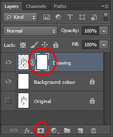
I will not explain Layer masks here but you can search for good tutorials on internet.

Step 6: Isolate the drawing

We will now detach the black lines from the paper.

  • PS > Magic Wand Tool with tolerance set to 0 -> 50 + options Anti-alias, Contiguous and Sample All Layers unchecked
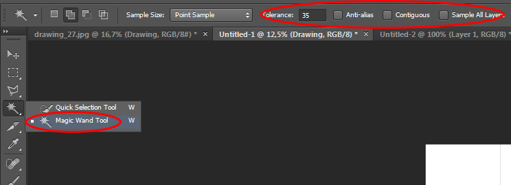
  • Click on a white area of the drawing and press Delete to remove the White colour from this layer. All that remains are the lines that have been drawn in ink.
  • Add a new layer below “Drawing” and rename it “Background colour”; fill in this new layer with white colour or any other colour and lock it.

Step 7: Flat colours and shadows

Prepare your layers to welcome colours:

  • Set blending mode of the “Drawing” layer to “Multiply”
  • Add a new layer below “Drawing” and rename it “Colours” + set its blending mode to “Multiply”. This layer will welcome your flat colours.
  • Add a new layer below “Colours” and rename it “Shadows”. This layer will welcome your shadows.
  • Add as many layers as you need (one by colour, one by effect, one by gradient, etc)
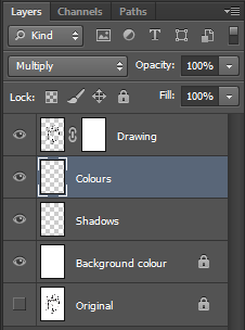
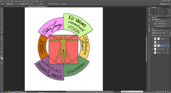
All what we have done till now was to prepare our work for colouring. You are ready now to fill in the related layers (Shadows or Colors) with colors:

  • You have complete freedom using the different types of brushes available to vary the effects and textures.
  • For shadows, I like the “Air Brush” with Opacity and Flow set to “25-75%” and brush size as large as possible
  • On closed delimited area, I use the “Paint bucket tool” with Contiguous and All layers options checked
  • On open delimited area, I use one of the “Lasso Tool” with Anti-alias option not checked.
Step 8: Draw

It may be useful to add lines to the original drawing.

  • Add a new layer below “Drawing” and rename it “Pencil” and set its blending mode to “Multiply”
  • Use different types of brushes or better, use the Pencil tool to draw (this is where the use of a stylus and a tablet makes a big difference compared to the mouse!)

Step 9: Save

Always save your work in Photoshop format (.PSD) , this allows you to keep your layers and to come back later if necessary.  Then, depending on the destination of your image:

  • For screen, typically for the web:
    • First reduce the size and resolution of the image to one that is suitable for a screen: PS Menu > Image > Image size > Set Resolution to 75 pixels/Inch and a set Width/Height (1024 pixels is already a large image on internet)
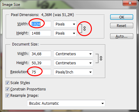
    • Then save it: PS Menu > Save for Web and devices > PNG-24 or Jpeg format
  • For printing, the question is more complicated. Ask to the “print officer”:
    • Required file format: EPS, PDF, TIFF, PSD, etc
    • Required color mode: CMYK (for offset printing) or RGB (for photo printing). You can set it in PS Menu > Image > Mode.
    • If all your fonts are supported (if you added text from Photoshop)
    • Export your work to the right file format: PS Menu > Save as

Step 10: Publish and share

In my opinion, the best solution is to publish your work on a website where you have the editorial control and to share/promote it from that place through social media. [This was valid in 2015 and still remains valid in 2018].

But there are plenty of other solutions out there:

  • You can publish your work on photo libraries like Flickr or on art galleries like Deviantart from where you can share/promote it on social media.
  • You can post and share directly your work on a social media platform like Facebook, Instagram, Tumblr, G+, Pinterest, etc (pay attention to the copyright of your images that is often transferred to the owner of the platform)
  • Finally, you can use cloud storage like Dropbox, Google Drive, etc.


Your questions and comments are more than welcome.


Share on:

A loop of gifts (on social networks)

Connections on Twitter have something incredible (probably on other social networks too, but Twitter is still my favorite). I am always amazed by Twitter ability to connect strangers who share the same interests, passions, and offer them this opportunity to enrich each other. The necessary condition is to work out loud. See for yourself.

One day, I read “Thinking Like a Network 2.0” Curtis Ogden’s article on the train while going to work. Each of the 10 principles resonated with me that I took my sketchbook and started to quickly illustrate each of them (despite the vibrations and discomfort). It’s my way of memorising things that matter or that I like. As per usual, I shared my sketchnotes on Twitter mentioning the article and its author:

The author, Curtis Ogden, contacted me to ask permission to post my sketchnotes. I of course gladly accepted, and “we both agree it is a wonderful example of what happens when you work out loud“.

Some weeks later, Curtis published my visual notes in a blog post of the Interaction Institute for Social Change (IISC), along with… a revised version of the 10 principles that I hastened to reread!

That’s the loop of gifts on social networks, and on Twitter in particular.

Share on: