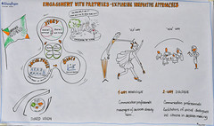
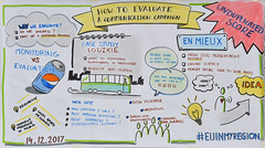
How to use space in graphic notes

Sketchnotes How to organise space in graphic notes
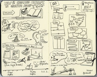
There are no magical rules to succeed! Only practice will help you to capture the essence of a speech, a presentation, a training, in… a short amount of time and space!

The practice consists in listen for key ideas, then recognize verbal cues that best identify these ideas and quickly replicate them through drawings and visual elements.

Preparation is key! What can you do in advance?

  • Get as much information as possible on…
    • the agenda: timing, talk points, breaks, etc, everything is precious
    • the speaker(s): background, photo, speaking style and pace
  • Prepare a library of possible icons and visuals on the subject by drawing them on a piece of paper from internet or Bikablo books
  • Prepare your sketchnotes:
    • Title, date, place, name of the speaker, twitter account/website, etc
    • You can sketch the speaker from a photo, the location (Paris, Bxl, NY), etc
    • Any footer with your signature?
    • If you are sure, you can already draw lines with a pencil to divide the available space in sections

Before the start

  • Choose a strategic place:
    • To have a clear view [then not the back of the room, nor the first row]
    • Comfortable enough to have your bloc-note and pens handy
  • Like an athlete before a competition, put yourself in the right mental condition:
    • Connect with yourself, with all your means, with your imagination and your fantasy
    • Don’t be afraid, your role is not produce a full transcript [minutes takers are there for that, or not, not you]
    • You can miss elements, don’t worry, your intuition will support you
    • Breathe calmly and relax you
  • Divide your paper in sections corresponding to the schedule but be VERY CAREFUL with that:
    • Speakers are unpredictable:
    • It’s better to capture what they really say, instead of anticipating what they had planned to say
    • Don’t numbered in advance their points, they can skip a point to stay in time or they can forgot to mention it
  • Remember that no law requires that your work is to be confined in one single page

Let’s go

  • Depending on your skills/mood of the day, you can prefer to work in monochrome or using more colours (a maximum of 4 colours is recommended by Brandy Agerbeck). You can also postpone full colourisation for after the event and use my guide How to colour your drawings in 10 steps
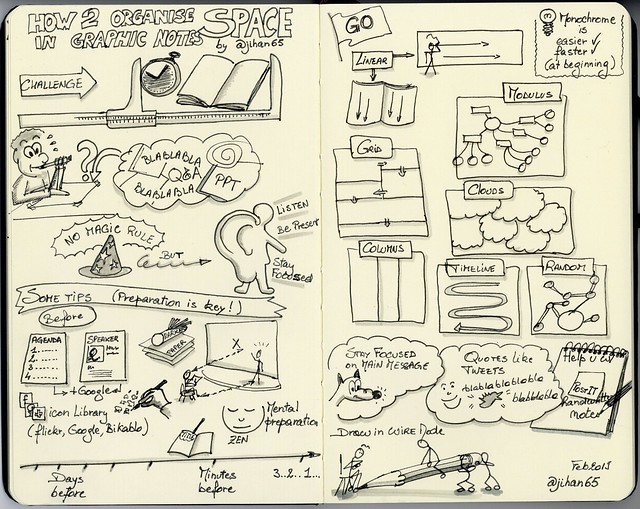
  • Depending on your preparation or intuition, you can opt for one of these models:
    • Linear which is the most common, easiest, more secure. It can spread on several pages with a typical start from the top-left corner, then continue to the bottom or to the right
    • Modulus like mind-map or web. Typical start from the center, use of lines to connect containers, any kind of lines and containers
    • Grid like in comics
    • Clouds
    • Columns
    • Timeline
    • Random
      Sketchnotes How to organise space in graphic notes
  • Stay focused on the main message and try to discard details that don’t reinforce it
  •  Forget to capture everything, that’s not the goal. What matters are your takeaways about what you considered important
  • Note great quotes like tweets, represent them visually
  • Draw simple objects in wire mode, especially people, you can come back on them later
  • Use a pencil to write keywords on which you can come back later
  • Use post-its (I use plenty of post-its)

Beforehand practice

  •  Search on sites like RSA, TED.com, Coursera for a short but inspiring speech and sketch it
    • Do it alone, or better… with others in order to compare, explain, confront your ideas [community of practice principles]
  • Build your own visual library by drawing in a sketchbook your icons to represent real objects like cup, pencil, doors, etc, and more abstract concepts like collaboration, idea, planning, etc.

Related post: To know what you’re going to draw, you have to begin drawing
In this second post, I expand my answer by talking about the importance of presence and listening.


Share on:

12 mois d’illustrations

Que vous inspire le nombre 12?
Les douze coups de minuit? Peut-être un nombre sublime en mathématiques? (peut-être pas, désolé, j’aime bien les maths). Peut-être pensez-vous au nombre de signes du zodiaque, d’étoiles sur le drapeau Européen, de disciples de Jesus, de syllabes pour un alexandrin, de côtes dans votre corps, de travaux d’Hercules? Laissez courir votre pensée autour de ce nombre. Divaguez dans les mythes et les religions où il revient souvent.

Douze, c’est aussi et plus simplement, le nombre de mois dans une année. Eh ben, me direz-vous, toute cette diversion pour en arriver à cette banalité? Oui, car j’avais besoin que votre imagination s’évade en pensant au nombre douze, afin de mieux comprendre ce qui suit.

Ca fait un an, donc douze mois, que j’ai accepté de collaborer au blog toutestpossible.be de mon amie Florence Bierlaire en illustrant ses billets mensuels. Chaque mois, Florence m’envoit le texte de son prochain billet et elle me laisse carte blanche pour l’illustrer.

La confiance aveugle de Florence me rempli d’une joie immense car elle est le signe d’un respect, d’une reconnaissance et d’une grande amitié entre nous deux. Cette relation privilégiée fertilise le terrain où mon inspiration et ma créativité peuvent s’exprimer librement.

Liberté, certes, mais comme toute liberté il faut l’assumer. C’est pour moi un défi chaque mois. J’ai le trac quand je reçois l’email de Florence qui contient le texte de son nouveau billet à illustrer. De quel sujet s’agit-il? Vais-je en comprendre le sens? Serais-je inspiré pour l’illustrer? Trouverais-je un language visuel que les lecteurs de Florence comprendrons? Qui soit respectueux du sujet, de Florence la psy, de Florence mon amie et surtout de ses lecteurs? Autant de questions, et d’autres encore, qui reviennent chaque mois.

Mes inquiétudes laissent toutefois rapidement place à l’appétit et à l’excitation.

J’entre alors dans le texte, un nouvel espace à découvrir, un autre renard à apprivoiser, une nouvelle semence à planter.  Mon procédé est pratiquement toujours le même: lire le texte, comprendre, relire, ne pas interpréter, rester dans ce qui est dit, digérer, attendre, laisser reposer, relire ça et là le texte, le butiner, garder en mémoire ou esquisser mes idées visuelles, surtout les premières qui s’avèreront souvent être les meilleures, surligner dans le texte les mots ou les phrases qui me marquent, croquer au crayon les liens mentaux entre ces idées fortes. Puis, faire le point lentement. Décanter. Méditer sur les mots, les idées, les visuels, les connexions, les couleurs, mes émotions, mes ressentis.

A la fin vient mon carnet de dessin où j’y agence mes idées en traits de crayon d’abord, en courbes, en couleurs et en ombres ensuite. Parfois simplement en noir et blanc.

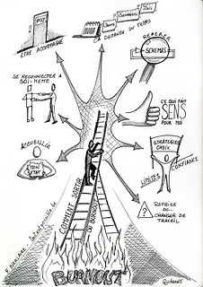
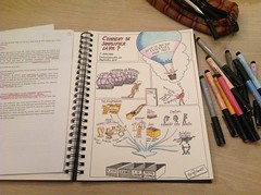
Voici les 12 illustrations de l’année 2017. Vous pouvez cliquer les images pour les agrandir et le lien en dessous pour lire l’article dans son entièreté:

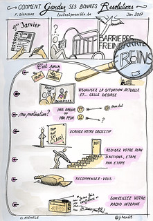
"Comment garder ses bonnes résolutions"
Janvier 2017: Comment instaurer de nouvelles habitudes dans votre vie?

"Comment déborder d'énergie?"
Février 2017: Comment avoir plus de jus au quotidien et déborder d’énergie?

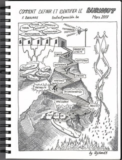
Comment définir et identifier le burnout
Mars 2017:  Le burn out: Comment définir et identifier ce mal qui nous consume?

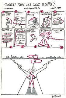
Comment faire des choix éclairés
Avril 2017: Comment faire des choix éclairés en 10 étapes?

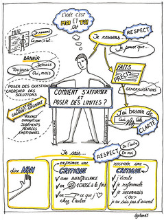
Comment s'affirmer et poser des limites
Mai 2017: J’apprends à m’affirmer et à poser mes limites

Sketchnotes: Comment sortir du burnout?
Juin 2017: Le burn out: Comment en sortir, comment se reconstruire ?

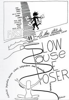
Sketchnotes "La slow attitude"

Juillet 2017: Retrouver l’art de flâner et adopter la slow attitude!

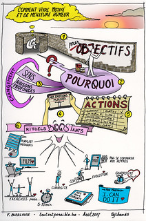
Sketchnotes: Comment vivre motivé et de meilleure humeur
Août 2017: Comment vivre motivé et de meilleure humeur !

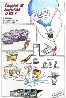
Sketchnotes "Comment se simplifier la vie?" Sketchnotes "Comment se simplifier la vie?"
Septembre 2017: Apprendre à se simplifier la vie !

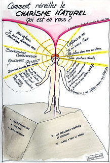
Sketchnotes "Comment réveiller son charisme"
Octobre 2017: Comment réveiller le charisme naturel qui est en vous ?

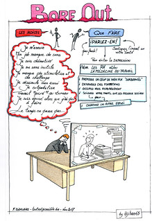
Sketchnotes "Le bore out"
Novembre 2017: Le Bore Out ! Un phénomène aussi destructeur que le Burn Out?

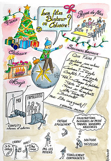
Sketchnotes "Les fêtes, du bonheur ou un calvaire?"
Décembre 2017: Les Fêtes de fin d’année : bonheur pour les uns, calvaire pour les autres !


Illustrer les billets de Florence qui traitent de psychologie ne fut pas chose aisée, même si l’humain et ses relations avec les autres et avec lui-même sont un domaine que j’apprécie particulièrement.  Je constate, outre l’aspect purement technique du dessin, que cela m’a demandé de la concentration pour bien comprendre ce qui est dit, et juste ce qui est dit, sans extrapoler. Une juste balance entre la méditation nécessaire pour digérer le sujet et … laisser courir mon imagination autour de ce dernier. C’est cet équilibre qui aura représenté la plus grande difficulté. M’en tenir au sujet mais imaginer loin comment le visualiser.

Les douzes articles de 2017 auront été un défi où, à chaque mois, j’aurais appris quelque chose. Ce fut avant tout une très belle expérience humaine entre Florence et moi. Je suis sûr qu’elle va grandir encore lors de cette nouvelle année (retrouvez les nouvelles illustrations dans mon album Flickr). Cette collaboration m’a aussi et surtout aidé à progresser dans ma pratique de l’illustration, dans celle de la lecture attentive ainsi que dans mes autres activités où j’utilise le language visuel.

Merci Florence!

Share on:

A loop of gifts (on social networks)

Connections on Twitter have something incredible (probably on other social networks too, but Twitter is still my favorite). I am always amazed by Twitter ability to connect strangers who share the same interests, passions, and offer them this opportunity to enrich each other. The necessary condition is to work out loud. See for yourself.

One day, I read “Thinking Like a Network 2.0” Curtis Ogden’s article on the train while going to work. Each of the 10 principles resonated with me that I took my sketchbook and started to quickly illustrate each of them (despite the vibrations and discomfort). It’s my way of memorising things that matter or that I like. As per usual, I shared my sketchnotes on Twitter mentioning the article and its author:

The author, Curtis Ogden, contacted me to ask permission to post my sketchnotes. I of course gladly accepted, and “we both agree it is a wonderful example of what happens when you work out loud“.

Some weeks later, Curtis published my visual notes in a blog post of the Interaction Institute for Social Change (IISC), along with… a revised version of the 10 principles that I hastened to reread!

That’s the loop of gifts on social networks, and on Twitter in particular.

Share on:

I like silence to focus

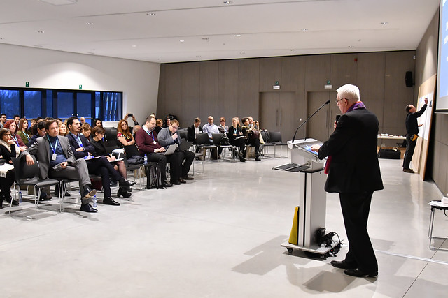
13 December 2017, it’s a quarter past twelve. I am alone in a still empty conference center. I have the feeling of a cold and too big space. I don’t like that feeling before the start of a 2-day event where more than 150 communicators coming from all over Europe should engage into conversations about next year comm’s actions. The waterspouts that pound the ground and the stormy wind outside the large windows reinforce my feelings. My colleagues of the European Commission, Anne and Matteo, who organise the meeting should arrive soon. Participants and speakers will arrive in a couple of hours. Few time to change my feelings into another reality.

Silently I observe the large room. Its configuration. Hundreds of empty chairs around the lectern. The large screen on the wall shows a big Windows blue logo. Silence. I note that the walls are not suitable for drawing. Bad. I note that there is a lot of space available and the room is bright. Good.

I use the silence to focus. To center myself. To sense the space around me, its nuances. I try to sense what can follow. How my work as graphic recorder can help participants to enter more deeply into the topics that will be presented. How it can encourage them to open their minds and take an active part in conversations.

This reflection convinces me even more that I have to be visible; I will be in front of the audience. My visuals have be visible from afar; I will draw big. I have to try to warm up the atmosphere and minds; I will use warm colours.

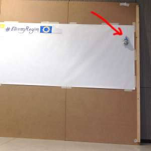
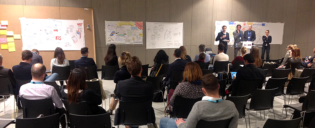
With the help of a worker, who popped up at the right moment, we find large wooden panels in the stock. We install them against the wall in front of the audience, on the left of the large screen and of the lectern. From my position I can connect with the speakers and with participants. I install a roll of paper 4 meters long on the wooden panels.

Setup for graphic recording at the INFORM meeting

With a string, I hang on a corner of the panel a little snowman doll (to be disruptive, not to be too serious, and also because the holiday season is approaching).

My markers and pastels are ready. The setup is ready. I feel ready. What will happen is the best that should happen.

My colleagues enter the room. Participants some time later. The meeting starts.

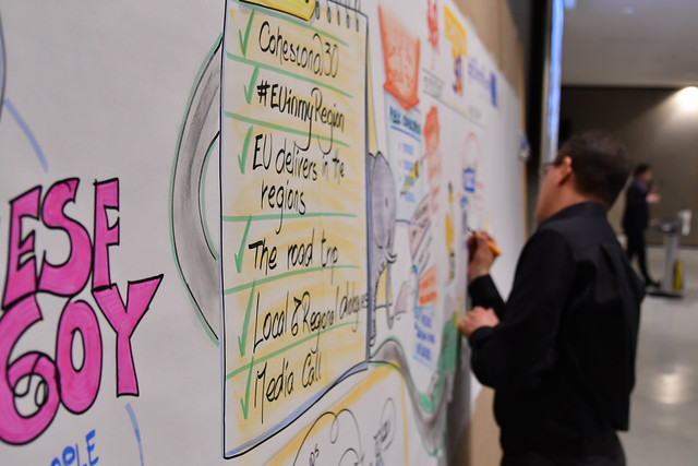
Graphic recording: INFORM meetingClick the picture to enlarge it

Graphic recording: INFORM meetingClick the picture to enlarge it

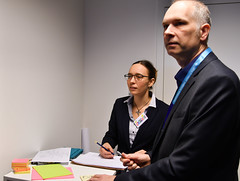
The next day, Catherine and Frederic, two colleagues-friends, come to help me in the graphic recording of the parallel sessions that I cannot cover.

Graphic recording: INFORM meetingGraphic recording: INFORM meetingGraphic recording: INFORM meeting
Click the pictures to enlarge them

At the end of the 2 days, we have filled up meters of paper with our graffiti, the visual essence of all presentations, discussions and debates.

Being present from the beginning of the meeting, I have a huge fresco that sums up the two days:

Graphic recording: INFORM meeting
Click the picture to enlarge it

Have my intentions (those of the previous day before everything starts) been reached?

I don’t know. But the comments that participants, speakers, my colleagues, shared with me during and after the event, make me think so. As well as the smiles and the sparkling eyes of some people (like Agnès, my boss) in front of the fresco.

I’m happy. Catherine and Frederic, my friends graphic harvesters, too. Anne and Matteo, my colleagues, too. A great collaboration.

I feel happy and grateful for what happened.


Notes:

The meeting brought together the two networks of communicators in Europe of EU Cohesion Policy, INFORM and INIO, and the expert groups of programme communication officers from two DGs of the European Commission, DG REGIO and DG EMPL. It took place in the Mons International Congress Xperience (MICS) on 13-15 December 2017. “Our graffiti”, the graphic harvesting material, are part of the final report that was shared with all participants. More than 80% of participants said in the satisfaction survey that graphic recording was useful for them.

Share on:

Draw my mind: The benefits of visual note-taking

As internal communicator at the European Commission, I had the privilege to participate to the 2015 Internal Communication Summit organised by Melcrum (now CEB) in London. During the summit, I took visual notes, sketchnotes, of many sessions and shared them on Twitter. Organisers quickly “found me” in the room and an interesting chat on the power of visuals started.   What follows is a transcript of the interview, of me by Iliyana Hadjistoyanova from Melcrum, that was originally posted  on the Melcrum site on 9 Nov 2015 (see the note):
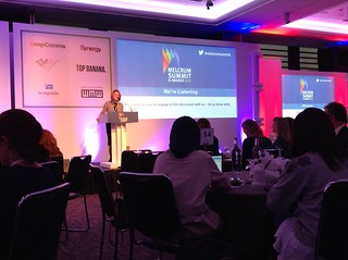
#melcrumsummit 2015

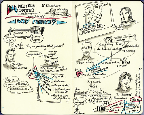
The 2015 Melcrum Summit brought together internal communicators from around the world for two days of lively conversations about organizational purpose. As delegates followed #melcrumsummit on Twitter to get the latest on Summit presentations, they noticed a set of incredible drawings pop up throughout the day, capturing presenters’ faces and arguments. Claudio Nichele from the European Commission is the communicator behind these drawings and he kindly agreed to share with us his personal highlights from the Summit along with the story behind his interest in visual storytelling.
#melcrumsummit 2015

“For me the Summit is an opportunity to recharge my batteries by listening to great speeches and different points of view,” Claudio attested. “Purpose matters both at the top and bottom of the organizational pyramid, which is why it’s so important to make sure there’s a strong connection between organizational and individual purpose.” That balance between the two brings meaning to Claudio’s own work as an internal communicator at the European Commission. “A better Europe for me, for my friends, for my children, a better Europe to live in, work in, grow in; I’m totally aligned and working for that. At the Commission, we may disagree on different aspects of execution, but we are all aligned on the idea.”

Beyond child’s play: How does doodling work?

A study in the Applied Cognitive Psychology journal concluded that doodling can help us to better comprehend and retain information. When randomly tested, research subjects who were requested to doodle while listening to a phone call were able to recall 29% more of the information from the call versus those who just wrote down notes. According to the lead researcher on the experiment, doodling is instrumental in reducing episodes of daydreaming, which is a frequent response to the boredom a particular task might cause us to experience.

For Claudio, doodling is faster and easier than old-school note-taking, and the fact that he is an artist also helps, but that’s not the reason why he’s chosen to practice it. He insists that the goal of doodling isn’t to produce art, or anything beautiful, for that matter. Moreover, even though he started drawing at a very young age, he says that this is not an activity reserved for children. Claudio believes in the neurological superiority of doodling versus traditional note-taking and that’s the argument he uses to convince colleagues, who are unsure of their drawing skills, to try to take visual notes.

“When you’re doodling,” he says, “you’re working with both sides of your brain.” Taking text notes, for example, requires mostly using the left part of the brain. But when you start to draw, you’re accessing the other side, too – the one that controls imagination and creativity. In addition, you have the added layer of kinetic movement and you find both your mind and body involved in translating what you see and hear into visual notes. That kind of comprehensive internalization is crucial later on when you revisit your notes because it provides multiple reference points for teasing out memories.

Active listening makes for superb scribes

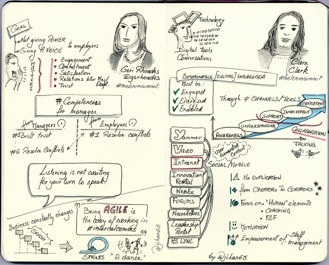
Claudio shared that he loved doodling about Rolls-Royce Claire Clark’s Summit presentation because he found the content extremely engaging (“I’m a techie guy also”).
#melcrumsummit 2015 sketchnotes

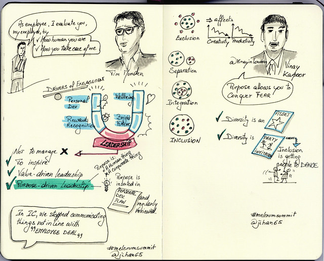
Another favourite for him was BNP Paribas Vinay Kapoor’s visual representation of the path from exclusion to inclusion. ”This for me is a complex topic that is brilliant to visualize,” Claudio explains. “The simplicity of his sketches was amazing and I actually took very few notes there because I just wanted to sit and listen.”
#melcrumsummit 2015 sketchnotes

This brings us to another ‘must’ for productive doodling – the quality of one’s listening. When coaching people how to take visual notes, Claudio talks about different levels of listening. One could just listen and record everything word for word. Or, you could draw a simple image that depicts part of the presentation but that way you can fill pages and pages with disjointed drawings. However, there are deeper levels of listening where one builds connections between the elements of what’s been said, so being an active listener is essential when trying to tell a story visually. Read Kelvy Bird’s excellent post on “The 4 Levels of Scribing“. And if you’re too tired to doodle, just sit back and listen, Claudio advises.

No art superpowers required

But what if someone is really embarrassed of his or her drawing skills? “I’ve witnessed this many times,” Claudio confirms. “Many people regard doodling as something reserved for kids. If you see someone doodling in a meeting, you might assume that they’re not paying attention, that this is not serious, and I want to fight this assumption.”

Claudio isn’t alone in hoping to empower aspiring doodlers. Michael Gough, a developer at Adobe, argues that drawing might be as important as reading or writing for the way we learn to think and communicate. Thus, as part of the “drawing as literacy” idea, Adobe made its first investment into hardware in 2014 by creating an internet-connected stylus and ruler, which makes drawing on an iPad significantly easier, especially for those who aren’t great at art. For Gough, who was on the team that developed the new hardware and matching apps, drawing is one of the most creative and distinctively human activities in our technology-driven world because, as he puts it, “Machines don’t dream.”

To help peers overcome their shyness, Claudio advises them to start small by maybe trying to draw very simple images, like a cup of coffee, at home and then progress to more complex drawings, executing them gradually faster. He even recommends getting a group of trusted friends together to try out doodling collectively in order to exchange ideas and tips without feeling judged.

What’s in it for communicators?

Claudio believes that these are all points that could help communicators deliver messages more effectively. For instance, some years ago, his department was appointed a new Director-General (the equivalent of a CEO in a private company), who requested major changes in the way the Commission ran its intranet. When Claudio’s boss told him about the changes, Claudio tried to explain his department didn’t have enough time to apply all of them, given its available resources. So, he asked his boss to give him a chance to personally make his case to the Director-General. And instead of using Powerpoint or Excel, he quickly sketched a story, presented it and the Director-General accepted his proposition. Why? “Because I was disruptive. I approached him with unconventional thinking. When I went to his office with a drawing, he said, ‘Oh my God, what is that?’ And when he looked closely, it helped him think differently about the problem. This for me was the opportunity to make my case and he accepted my explanation.”

Indeed, at a time when the average human’s attention span is one second less than that of a goldfish, communicators need to fight a tough battle to keep employees interested. According to Claudio, creative visual storytelling offers a potential change in mindset that could provide a solution. “If you go to someone with a Powerpoint, which is something that is in their comfort zone and they are desensitized to it, they will carry on with their current thinking,” he explains. “But if you go with a drawing, which is personal and unconventional, they are startled for a second and that gives you a short window of time to really get through to them and to access a part of them that’s less resistant.”

“It works, I can personally confirm that,” the doodling communicator concludes and sends us off to try drawing our first cup of coffee.


Note: The Melcrum/CEB site is restricted to the company’s customers, you may have no access to it.
Share on: